Stephen Curry:
Image Assignment
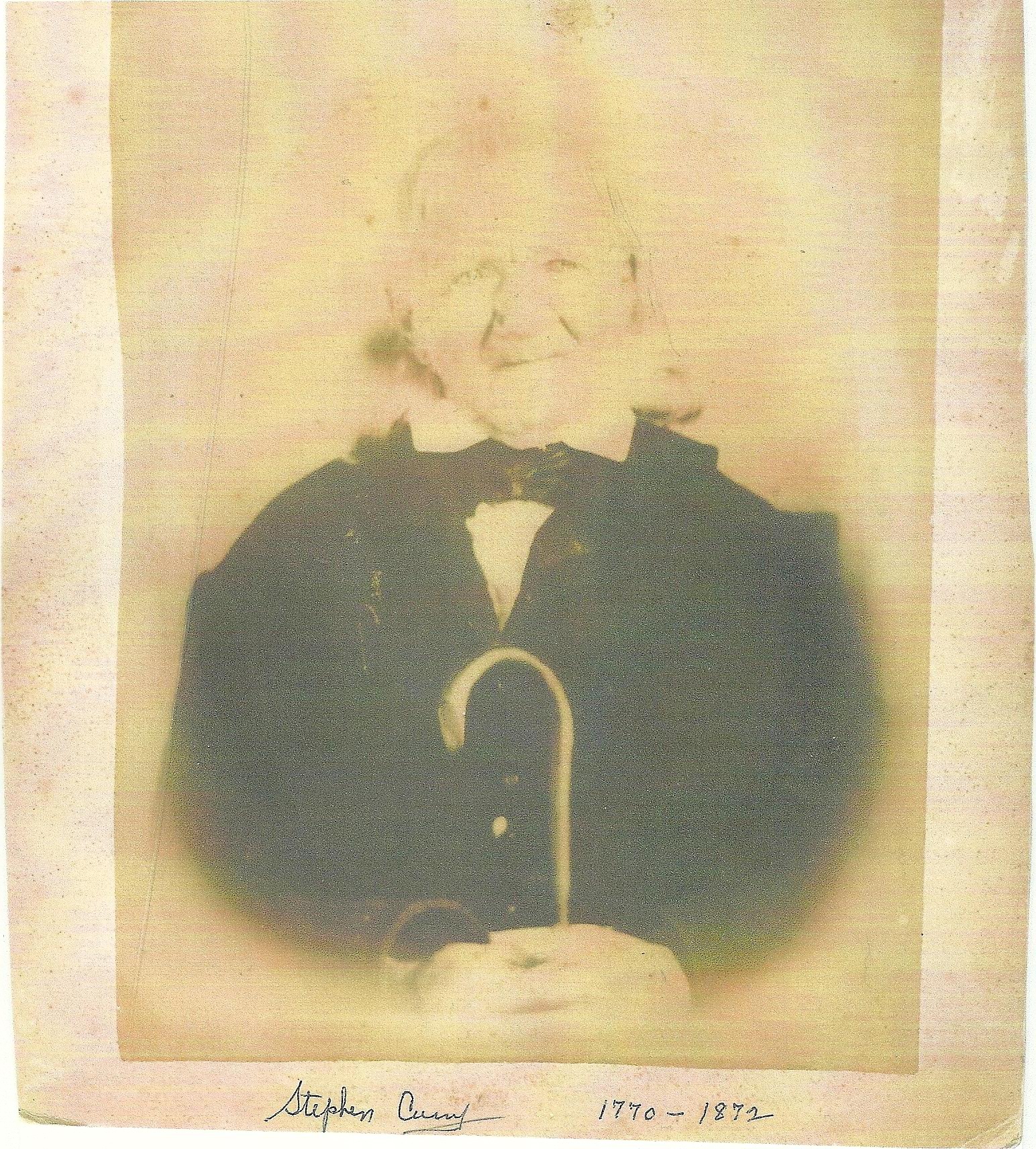
For this week’s assignment, we were required to demonstrate mastery of image editing skills, color and composition. To accomplish this, we were asked to create a web page that includes: a cropped and resized image, a restored photograph, a hand-colored photograph, a vignette photograph, a matted engraving and a “before and after” for each example. The original before photograph I used was this image of Stephen Curry (My Great-Grandfather’s Great-Grandfather) who died atthe age of 101 in 1872. I believe this picture was taken circa 1870. The image has several problems to include: general fading and yellowing, loss of facial details due to fading, blending of chair with black suit, complete fading of hair on the left side of head, complete fading of jaw line on right side of face. .
Stephen Curry Original Photo

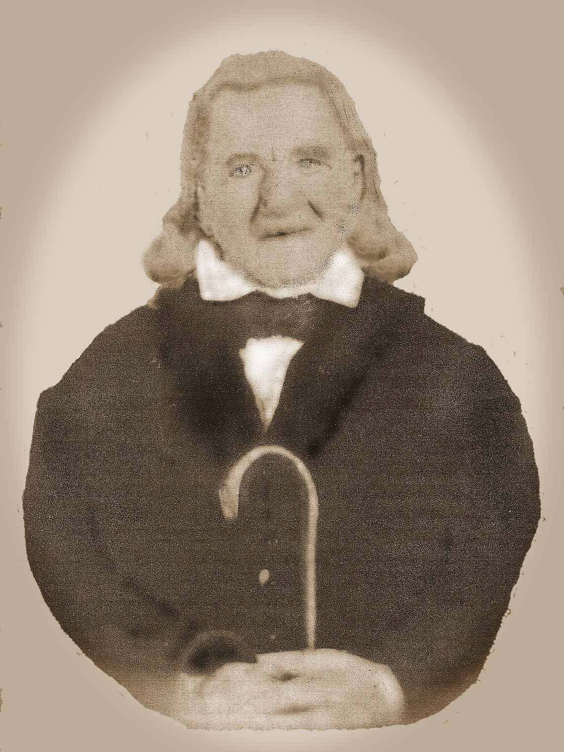
To improve and fix the issues identified above, I first used the auto contrast, auto tone and curves tool to make general improvements to the image. After this, I experimented with changing the image into a black and white and then sepia image. Because it seemed to bring out subtle details, I finally decided on Sepia. I also erased the back of the chair sticking out from behind his shoulder which blended in with the dark suit and used the dodge tool to whiten his shirt and collar. I then removed the entire background and replaced it with a light gray color that seemed to work well with the sepia. With these more general issues addressed, I added hair to the left side of his head by copying and flipping the hair on his right side. I then detailed his face, hair and hands using the burn and dodge tools. I also lightened the cane with the dodge tool in order to increase the contrast with the dark suit. The final result is:

I also added a vignette to this image which I thought resulted in a nice affect. I did this by using the elliptical marquee and selecting the inverse. I then used brightness and contrast to adjust the vignette. The final result is:

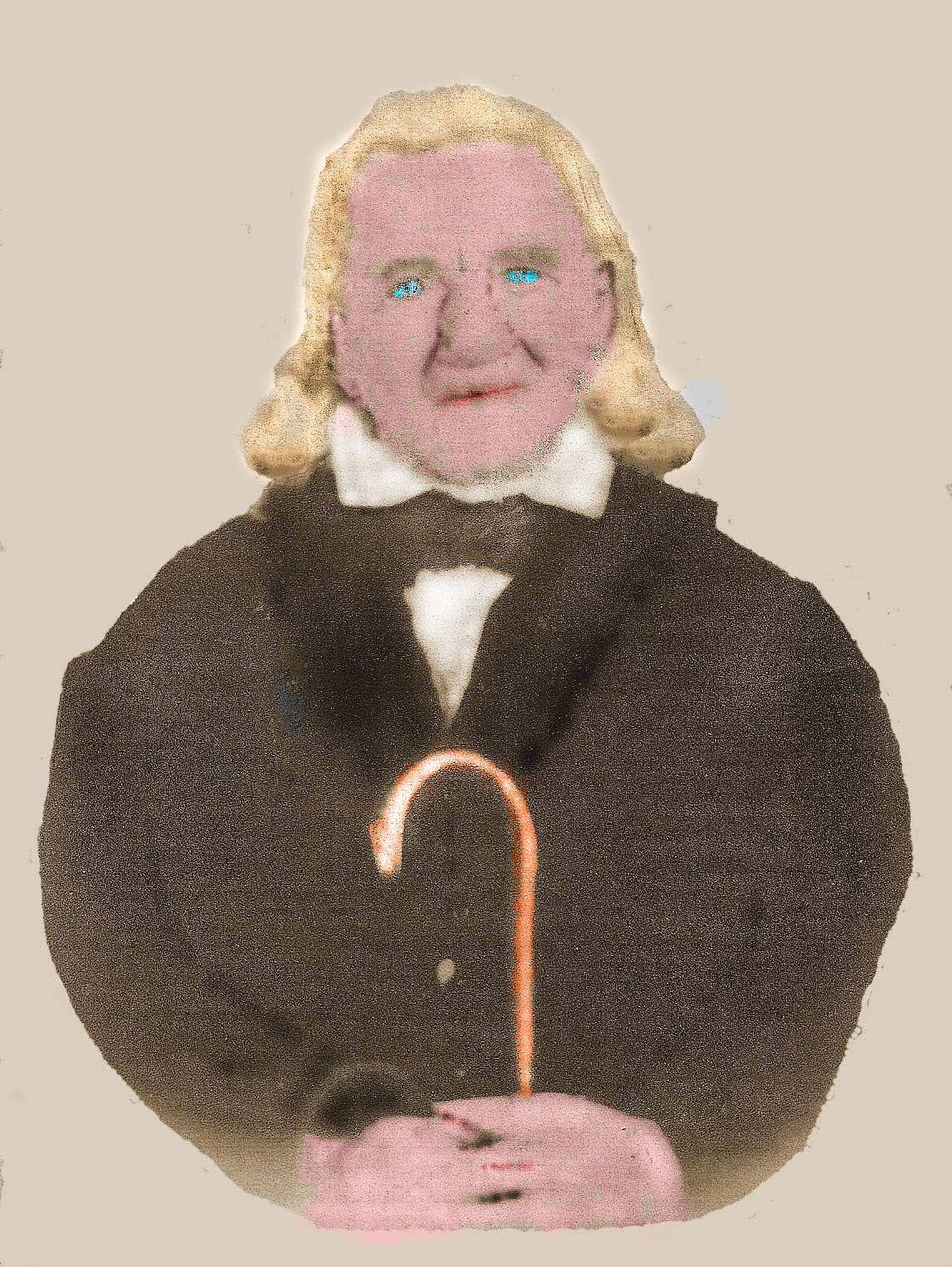
We were also asked to colorize the image. I did this with a combination of the dodge and color replacement tool. The final result is below. The colorization of the eyes and hair did not work out well, but I thought the colorization of his skin, lips and especially the cane went relatively well.

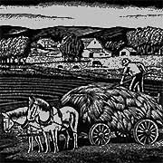
The final requirement of the image assignment was to add a matted engraving. The engraving I chose is below.

I cropped the image and then followed the directions for matting an engraving on archiva.net. I chose the same background color used in the earlier image of Stephen Curry and will be the background color of the web page.

Overall, I was very satisfied with my progress in learning how to use Photoshop. I made a lot of mistakes, but have become much more comfortable with the tool. I look forward to improving my skills with Photoshop in the future. I feel that my first cut at improving the Stephen Curry photo somehow lost the “essence” of his facial features. In a future second attempt, I will use a much lighter hand when trying to bring out details.
This page was updated 04/14/2014
Copyright April 2014